
AI Poster Typography: Mastering Text Layout for Impactful Designs
Your poster's message is only as strong as its text layout. Marketing professionals and business owners often overlook typography when rushing to create promotional materials. Yet typography is precisely what makes their message legible and compelling. A stunning image grabs attention, but the text converts that attention into action. Is your poster's text making the right impact?
Ready to transform your poster text from functional to unforgettable? We'll show you exactly how. We’ll cover everything from font choice to visual hierarchy, giving you the skills to create designs that truly communicate. With a powerful tool like PosterDesign.net, applying these principles is easier and faster than ever. You can start designing right away and see the difference for yourself.

AI Poster Design: Choosing the Right Fonts
The first step in effective typography is selecting the right fonts. Fonts have personalities. A bold, modern font conveys strength and innovation, while an elegant script font suggests sophistication. When using an AI poster generator, you have access to a wide variety of styles. Choosing wisely is key to reinforcing your message. Think about your target audience and the emotion you want to evoke.
For a tech product launch, a clean, sans-serif font like Helvetica or Open Sans works perfectly. For a vintage-themed café promotion, a serif font like Playfair Display or a retro script might be more appropriate. The goal is to match the font's character with your poster's purpose.
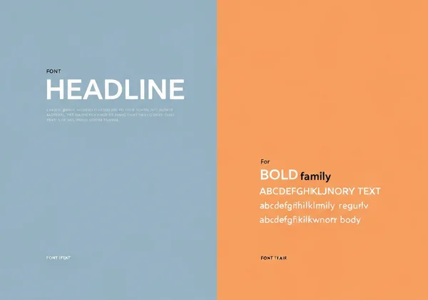
Font Pairing Strategies for Maximum Readability
Using more than one font can add visual interest, but it's a delicate balance. A common mistake is using too many fonts, which creates a chaotic and unprofessional look. The golden rule is to stick to two, or at most three, complementary fonts.
Here’s a simple strategy for effective font pairing:
-
Contrast is Key: Pair a serif font (with small lines at the end of its strokes, like Times New Roman) with a sans-serif font (without those lines, like Arial). This classic combination creates a clear distinction between headings and body text.
-
Use Font Families: Another safe bet is to use different weights and styles from the same font family. For example, use a bold version for your headline and a regular or light version for your subtext. This ensures harmony while still creating a clear hierarchy.
-
One Expressive, One Neutral: If you want to use a highly stylized font for your main headline, pair it with a simple, neutral font for the rest of the text. This ensures the body copy remains readable.
AI Limitations and Font Customization Workarounds
While AI poster design tools are incredibly powerful, they can have limitations with specific font choices or intricate text manipulations. You might find that the AI generates text that is almost perfect but needs a slight adjustment. Instead of getting frustrated, think of the AI as your creative partner, not a final-word dictator.
For instance, an AI might not perfectly render a very specific custom font. A practical workaround is to use the AI to generate the background, layout, and overall visual theme. Then, you can download the high-resolution image and use a design editor to add your specific text elements. However, tools like PosterDesign.net are constantly evolving, offering more control over text. You can often guide the AI by specifying "bold typography" or "elegant script" in your prompt to get closer to your desired outcome.
Text Hierarchy in AI Poster Design: Visual Flow Techniques
Once you've chosen your fonts, the next step is arranging your text to guide the reader's eye. This is called visual hierarchy. A well-designed poster directs the viewer through the information in a logical order, from the most important message down to the finer details. Without a clear hierarchy, your audience won't know where to look first, and your message will be lost.
Think of your poster as telling a story. The headline is the dramatic opening. The subheadings are the key plot points, and the body text provides the supporting details. Use size, weight, and placement to control the narrative. This ensures your core message is understood in seconds.
Creating Effective Visual Hierarchy with Text Size
The easiest way to establish a visual hierarchy is by varying text size. Your main message or headline should be the largest text element on the poster. It's the first thing people will read, so make it count.
Follow this simple three-level structure:
- Level 1 (Headline): This is your hook. It should be the biggest and boldest text, instantly communicating the poster's main purpose (e.g., "50% Off Sale," "Grand Opening," "Concert Tonight").
- Level 2 (Subheadings/Details): This level provides essential information like dates, times, or key benefits. It should be smaller than the headline but larger than the body text. It gives context to your main message.
- Level 3 (Body Text): This includes the fine print, such as a website, contact information, or a detailed description. This text should be the smallest, but still perfectly legible.
When you design your own poster, you can easily specify these elements in your prompt or use the editor to adjust sizes after the initial generation.
Strategic Text Spacing and Alignment Techniques
How you space your text is just as important as its size. Proper spacing, including line spacing (leading) and letter spacing (kerning), dramatically improves readability. Crowded text is difficult to read and looks unprofessional. Give your words room to breathe.
Alignment also plays a crucial role in creating a clean, organized look.
- Centered Alignment: Often used for formal invitations or minimalist designs. It creates a sense of balance and stability but can be harder to read in large blocks of text.
- Left Alignment: This is the most natural and readable alignment for body text, as it follows how we typically read. It provides a strong, clean edge on the left side.
- Right Alignment: Use this sparingly. It can create a dynamic, edgy feel but is challenging to read for more than a line or two.
Experimenting with these techniques is simple. An AI tool can generate multiple layout options in seconds. This allows you to quickly see which spacing and alignment best fit your design.
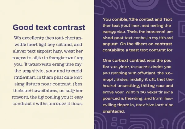
Color and Contrast for Typography That Stands Out
Your typography can be perfectly structured, but if no one can read it, it fails. This is where color and contrast come in. High contrast between your text and its background is non-negotiable for readability. The most classic example is black text on a white background, but you can be more creative.
Dark text on a light background or light text on a dark background are both safe and effective choices. Avoid placing text over a busy, multi-colored image without a solid color block or a subtle overlay behind it. Remember, clarity comes first, and creativity comes second.
Text-Color Psychology for Different Poster Types
Color isn't just for contrast; it evokes emotion and reinforces your brand's message. Understanding basic color psychology can elevate your poster design from good to great.
- Red: Creates a sense of urgency, excitement, and passion. Perfect for sales, clearance events, or promotions.
- Blue: Conveys trust, calmness, and professionalism. Often used by tech companies, financial institutions, and healthcare providers.
- Green: Associated with nature, health, growth, and wealth. Ideal for environmental topics, organic products, or financial services.
- Yellow: Radiates optimism, warmth, and happiness. It’s great for grabbing attention but should be used carefully as it can cause eye strain.
- Black: Signifies power, luxury, and sophistication. A popular choice for high-end brands and formal events.
When creating a poster for your event, consider what feeling you want your audience to have and choose your text color accordingly.
Testing Readability with AI Tools
How do you know if your poster is readable from a distance? One of the best ways is the "squint test." Step back from your screen and squint your eyes. What elements still stand out? If your main headline and key details are clear, you’ve created a strong visual hierarchy. If everything blurs into one blob, you need to increase your contrast or adjust your text sizes.
AI poster generators are fantastic for this. You can generate several variations of a design with different color palettes and layouts in seconds. This allows you to compare them side-by-side and quickly identify the most effective and readable option without spending hours on manual adjustments. Ready to see it in action? Try our free tool and generate a few versions of your idea.
Transform Your Message with Master Typography
Great typography makes your message impossible to ignore. With PosterDesign.net, you don't need design expertise to create professional posters that command attention. Our AI-powered tool makes it simple to apply these principles to your next project. Ready to see the difference? Create your first design today!
FAQ Section
How many fonts should I use in my poster design?
For a clean and professional look, it's best to stick to two fonts. A common strategy is to use one font for headlines and another for body text. Using more than three fonts can make your design feel cluttered and confusing to the reader.
Can AI generate custom fonts, or should I stick to presets?
Most AI design tools, including PosterDesign.net, work with a vast library of existing, high-quality fonts. While they may not generate a brand-new font from scratch, they can creatively apply styles and effects to text. For most users, the available font presets and styles are more than enough to create a unique and impactful poster.
What's the ideal text-to-image ratio for effective posters?
There's no single magic ratio, but a good rule of thumb is to let your visuals dominate. Posters are a visual medium. Aim for a design where text occupies roughly 20-30% of the space, leaving plenty of room for powerful imagery and negative space. The goal is to communicate quickly, not to present an essay.
How do I ensure my text is readable when printed?
To ensure readability in print, use high contrast, choose clean fonts, and make your text large enough to be read from a distance. Always download your final design in the highest resolution available. Before printing a large batch, it's a great idea to print a single copy as a test to check the colors and text clarity. You can easily create print-ready files when you use our AI tool.