
Business Poster Design Briefs for Faster AI Drafts
A business poster can fail before the first image is generated. The usual problem is not the tool. It is the brief.
Many teams begin with a vague request like "make a poster for our event" or "we need something for the sale." A text-to-poster workflow works much better when the prompt names the offer, the audience, and the viewing context.
That is why a structured brief matters before opening the AI poster generator workflow. A clear brief gives the model a sharper visual direction, keeps the message focused, and makes it easier to adjust ratio, poster type, or uploaded photos without starting from zero.

Why business poster ideas stall before the design stage
Business poster design often gets treated like a style problem when it is really a decision problem. A marketer may know the campaign goal, but not the single message that deserves the most space on the poster. A founder may know the product launch date, but not whether the poster needs to drive awareness, foot traffic, sign-ups, or direct purchase intent.
That confusion creates weak prompts. The draft becomes crowded because every detail feels equally important. It also looks generic because the brief never defines the audience or placement.
A better starting point is simple: define one outcome, one audience, and one placement. Once those three pieces are clear, the poster brief becomes much easier to turn into a practical draft inside a business poster homepage tool.
What a business poster design brief needs before you generate anything
A useful brief does not need design jargon. It needs the same input fields the site already supports: campaign goal, short visual description, aspect ratio, poster type, and optional source image. When those details are specific, the first draft usually becomes easier to judge.
Match the campaign goal to one poster outcome
Start with the one action the poster should support. That action could be announcing a launch, filling a hiring event, selling workshop tickets, or driving attention to a flash sale. If the brief tries to do all four, the headline loses focus and the supporting details pile up too early.
A strong business poster design brief usually answers five questions in one short block:
- What is being promoted?
- Who should notice it first?
- What should they understand in three seconds?
- What detail must appear on every version?
- What mood should the poster create?
This is also the right moment to decide whether the poster is meant to be polished inspiration, a fast internal concept, or a starting point for later edits. The tool is most useful when it is treated as a fast visual draft system rather than a promise of a final print-ready file.
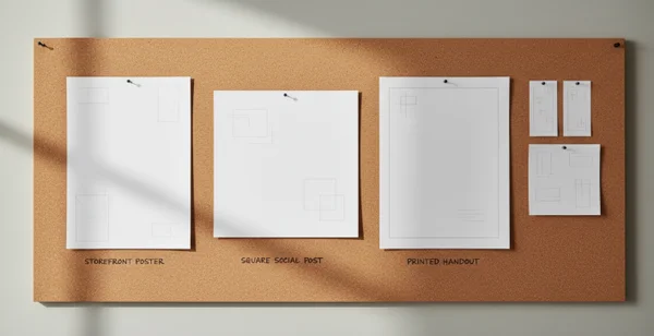
Add audience, placement, and aspect ratio details
Placement changes the whole brief. A poster for a shop window needs a different crop and information order than a poster for a square social post or a printed handout. The University of North Florida lists 24 x 36, 36 x 48, 42 x 56, and 42 x 60 as common preset poster print sizes. It also notes that a standard poster is 48 inches wide by 36 inches high. That is a useful reminder that format should be named early rather than guessed later. See the [UNF poster design guide].
Audience detail matters just as much. "Young professionals near our coworking space" is more useful than "everyone." "Parents looking for a weekend class" is stronger than "local community." Name the poster type as well. If an uploaded photo should be used, say that early so the first draft can be judged against a real business goal.
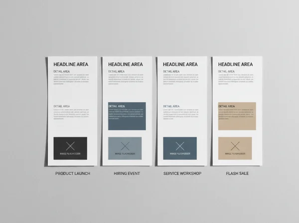
Four business poster design briefs for real campaign scenarios
The fastest way to improve business poster design is to borrow a structure that already matches the campaign. Each example below keeps the brief tight enough for an AI workflow while still giving the design a clear job.
Product launch poster brief
Use this format when the poster introduces a new item, service, or feature.
- Goal: build awareness for a new launch.
- Audience: existing customers and nearby prospects.
- Core message: what is new and why it matters.
- Required details: product name, launch date, short value line.
- Visual direction: clean, high contrast, product-focused.
- Input note: use an uploaded product image if the product shape is important.
This brief works because the poster does not try to explain the full offer. It gives the draft one clear hero message and enough support details to stay credible.
Hiring event poster brief
Use this structure when the poster needs to attract applicants to a date-based recruiting event.
- Goal: increase attendance at a hiring session.
- Audience: local applicants with the right role fit.
- Core message: the role category or hiring theme.
- Required details: date, time, location, and what candidates should bring.
- Visual direction: trustworthy, clear, organized, not flashy.
- Input note: choose a poster type that leaves room for practical details.
Grand Valley State University's poster design guide says bigger font reads as more important and that text hierarchy should match the message the poster is trying to communicate. That is a helpful rule for hiring posters, where the role headline, date, and location should outrank every secondary detail. The same guide also notes that images should remain clear from about 5 feet away. That is a good reality check when a brief depends too much on small decorative content. See the [GVSU poster design guide].
Workshop or webinar poster brief
Use this when the poster promotes a learning session and the value depends on topic clarity.
- Goal: drive sign-ups for a scheduled session.
- Audience: people who already care about the topic.
- Core message: the session promise in plain language.
- Required details: topic, speaker, date, time, and format.
- Visual direction: focused, calm, easy to read.
- Input note: keep the headline benefit short and move extra details lower.
This brief works best when the promise is concrete. "Learn three ways to improve storefront photography" is clearer than "Join our creative workshop." Readers should understand the topic before they notice decorative details.
Flash sale poster brief
Use this structure when urgency matters more than explanation.
- Goal: highlight a short sales window.
- Audience: current shoppers or nearby foot traffic.
- Core message: the offer and its deadline.
- Required details: discount, dates, key product category, store context.
- Visual direction: bold, limited copy, strong contrast.
- Input note: avoid listing every condition in the first draft.
A flash sale poster needs discipline. The first version should spotlight the offer, then the time limit, then one supporting detail. If every condition enters the headline zone, the poster stops feeling urgent and starts reading like small print.
How to improve weak AI drafts without rewriting the whole brief
Most weak drafts do not need a total reset. They need one or two targeted changes.
Fix unclear hierarchy and crowded copy
If the draft feels messy, check the message order before changing the style. Ask whether the top line names the main offer, whether the second line supports it, and whether the detail block belongs lower on the poster. A better draft often comes from deleting one idea, not adding another.
The University of North Florida recommends keeping content away from the perimeter because that area can fall into the bleed area and get cut off during printing. That matters even when the current goal is only a concept draft. Keep essential text away from the edges and avoid treating the outer border as free space.
GVSU also says white space helps readers separate information and suggests aiming for about 40% white space across the layout. If a draft looks crowded, reduce the number of message blocks, simplify the background description, and leave more room around the main headline.
Change poster type, ratio, or uploaded image on purpose
Some problems are not copy problems. A crowded vertical draft may improve when the ratio changes. A flat business poster may feel more specific after switching poster type or adding a real product, venue, or team image.
These changes work best when the brief explains why they matter. "Square version for local social promotion" is stronger than "make it square." "Use uploaded café interior photo as the visual base" is stronger than "add image." Those small inputs give the system a business context instead of a random edit request.
When the first version is close but not right, use the poster draft workspace as an iteration loop. Keep the campaign goal fixed, change one variable at a time, and compare results by clarity rather than by decoration.
Next steps for a stronger business poster draft
A strong business poster design brief is short, but it is not vague. It tells the draft what the poster must achieve, who should notice it, where it will appear, and which details deserve the most space.
That method fits the site especially well because the workflow already centers on prompt text, poster type, aspect ratio, and optional image upload. When those inputs reflect a real business scenario, the result is more likely to become a usable direction for a launch, hiring event, workshop, or sale.
Use the checklist and scenario briefs in this article as a planning layer before opening the text-to-poster homepage. That extra minute usually saves far more time in revision.