
Mastering AI Poster Design: 7 Key Design Principles
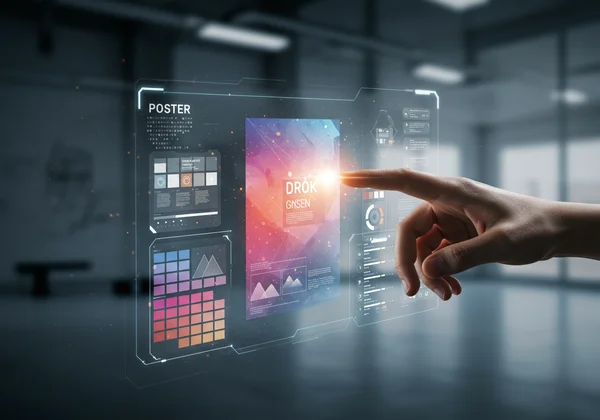
In the world of marketing, events, and education, a compelling poster is your silent ambassador. It has seconds to grab attention, convey a message, and inspire action. With the rise of powerful AI tools, creating visually appealing posters is easier than ever. But to transform a good AI-generated poster into a truly stunning one, you need to be the art director. This is where understanding fundamental design principles becomes your superpower. Ready to learn how to design a poster that truly captivates?
This guide will walk you through seven key design principles that will empower you to guide your ai poster design process with precision. You'll learn how to craft better prompts and refine your results, ensuring your visuals are not just created by AI, but expertly crafted by you. With these tips, you can unlock the full potential of an AI design tool and produce professional-grade work every time.
Unlocking Stunning Visuals: Core Poster Design Principles
Before you can build a masterpiece, you need to understand the foundation. These first four principles are the structural pillars of any great design. They create order, draw the eye, and make your message clear and professional.
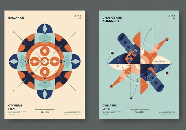
Balance and Alignment: The Foundation of Structure
Balance is the visual weight distribution of elements on your poster. A balanced design feels stable and harmonious. Symmetrical balance creates a formal, static feel by mirroring elements on either side of a central axis. Asymmetrical balance, while more complex, feels dynamic and modern by using elements of varying visual weight to create equilibrium. Alignment is the invisible grid that connects every element, ensuring your poster looks organized and intentional, not scattered.
- AI Prompt Tip: When using an AI poster generator, try prompts like: "Create a poster with a clean, symmetrical layout for a corporate webinar," or "Generate a dynamic, asymmetrical design for a music festival."
Contrast and Emphasis: Making Elements Pop
What is the single most important piece of information on your poster? Emphasis, achieved through contrast, ensures it gets seen first. Contrast is simply making elements different to create a focal point. This can be done with color (light vs. dark), size (large headline vs. small details), or font (bold serif vs. thin sans-serif). A poster without contrast is flat and forgettable; a poster with strong contrast directs the viewer’s attention exactly where you want it.
Repetition and Unity: Creating Cohesion
Repetition is the use of consistent elements throughout your design, such as a specific color, font, shape, or graphic style. This isn't about being boring; it's about creating a cohesive and unified look that reinforces your brand identity. When elements are repeated, they tie the entire composition together, making it feel like a single, well-executed piece. This is crucial for building brand recognition and a professional image.
Negative Space: The Unsung Hero of Effective Design
Negative space, or white space, is the empty area around your design elements. It's not wasted space—it's an active and essential component of a clean, sophisticated design. Negative space gives your content room to breathe, reduces clutter, and improves readability. It can also be used creatively to form shapes and guide the viewer's eye. Don't be afraid to embrace simplicity; often, what you leave out is just as important as what you put in.
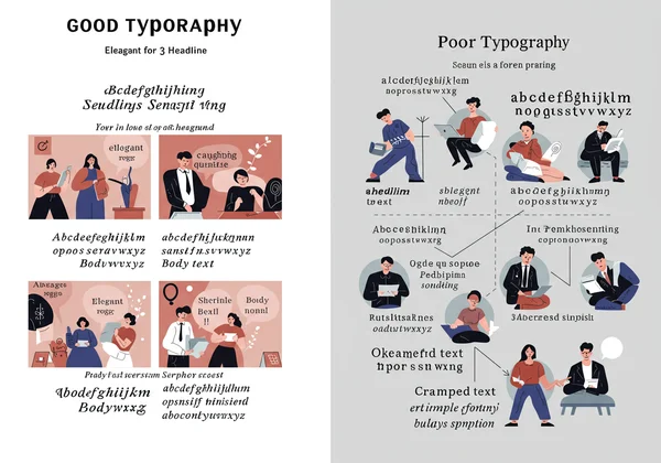
Mastering Typography for Impactful AI Posters
Typography is more than just readable text; it's the voice of your poster. The fonts you choose and how you arrange them can instantly set the tone, whether it's playful, elegant, futuristic, or serious.
Choosing the Right Fonts: Voice and Readability
Every font has a personality. Serif fonts (with small feet, like Times New Roman) often feel traditional and formal, while sans-serif fonts (without feet, like Arial) feel modern and clean. Your goal is to choose a font that matches your message and is easy to read from a distance. A common best practice is font pairing: using two or three complementary fonts—one for headlines, one for body text, and perhaps an accent font.
- AI Prompt Tip: Specify the feeling you want to evoke. For example, "Design a poster with an elegant serif font for a wine tasting event," or "Use a bold, futuristic sans-serif font for a tech conference." Ready to design your own poster?
Sizing and Spacing: Ensuring Clarity and Flow
Proper sizing and spacing (kerning and leading) are critical for readability. Your headline should be the largest, followed by subheadings, and then body text. This hierarchy guides the viewer through the information logically. Ensure there is enough space between lines of text and individual letters to prevent them from feeling cramped. A well-spaced typographic layout is pleasing to the eye and makes your message effortless to absorb.
Harnessing Color Theory in AI Poster Creation
Color is a powerful tool for communication. It evokes emotion, creates visual interest, and can even influence behavior. Understanding the basics of color theory will help you make intentional choices that support your message.
Building Effective Color Palettes with AI Prompts
You don't need to be a color expert to create a beautiful palette. An AI poster maker can do the heavy lifting if you guide it correctly. You can specify palettes by name (monochromatic, analogous, complementary) or by mood.
- AI Prompt Examples:
- "Generate a poster with a calming, monochromatic blue color palette."
- "Create an event poster using a high-contrast, complementary palette of orange and blue."
- "Design a vintage poster with a warm, retro color scheme of muted yellows, browns, and reds."
Why not try our poster maker and experiment with different color prompts?
Evoking Emotion: Psychology of Hues
Colors have psychological associations. Red can signify passion, urgency, or danger. Blue often conveys trust, calm, and professionalism. Green is associated with nature, growth, and health. Yellow suggests optimism and energy. Think about the feeling you want your audience to have and choose colors that align with that emotion.
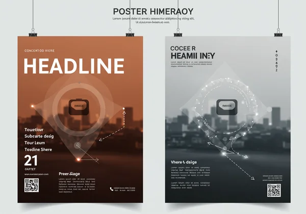
Crafting Visual Hierarchy for Clear Communication
Visual hierarchy is the arrangement of design elements in order of their importance. It's the visual roadmap that tells a viewer what to look at first, second, and third. Without a clear hierarchy, your message becomes a confusing jumble of information.
Guiding the Viewer's Eye: Prioritizing Information
The most effective posters guide the eye on a specific path. Typically, Western audiences read in a "Z" or "F" pattern, starting from the top left. Place your most critical element—your headline or key image—where the eye naturally lands first. Less important details, like contact information or dates, can be placed lower down in the hierarchy. Size, color, and placement all work together to establish this visual order.
Layout Strategies for Maximum Impact
Your layout composition is the final piece of the puzzle. It brings together balance, typography, color, and hierarchy into one cohesive whole. A strong layout ensures that even from a distance, the poster's main point is clear. When you generate a design with an online poster design tool, analyze the layout. Does it guide your eye naturally from the headline to the call to action? If not, you can refine your prompt or regenerate to find a layout that maximizes impact.
Beyond the Prompt: Your Journey to AI Design Mastery
Artificial intelligence is an incredible creative partner, but you are the director. By mastering these seven core principles—Balance, Contrast, Repetition, Negative Space, Typography, Color, and Hierarchy—you move beyond simply typing a prompt. You begin to make intentional, strategic decisions that elevate your work from automated output to artful communication.
Now it's your turn to apply this knowledge. Think about your next project, whether it's for a marketing campaign, a school event, or a personal passion. With these principles in mind, you are fully equipped to create posters that don't just look good, but also achieve their goals. Start creating now and see the difference for yourself!
Frequently Asked Questions About AI Poster Design Principles
How can AI help me apply design principles effectively?
AI tools like our AI poster generator are trained on vast datasets of successful designs, so they inherently apply principles like balance and color harmony. Your role is to guide the AI with specific prompts. By asking for a "minimalist design with a strong visual hierarchy" or a "poster with a complementary color scheme," you are using your knowledge to direct the AI toward a more effective and professional outcome.
What is the most important design principle for a stunning poster?
While all principles are interconnected, many designers argue that hierarchy is the most crucial for posters. A poster's primary job is to communicate quickly. If the viewer doesn't know what to look at first, the message is lost. A clear visual hierarchy ensures your key information is seen and understood in seconds.
Can I create a professional poster without design experience using AI?
Absolutely! That is the core value of an ai poster generator. These AI design tools are designed for users without a formal design background. By providing the AI with a clear idea and a few stylistic choices, you can generate professional-quality results instantly. Understanding these principles simply helps you refine those results to perfection.
How do I choose the best colors and fonts for my AI-generated poster?
Think about your message and your audience. For a corporate event, you might prompt the AI for a "professional sans-serif font and a trustworthy blue color palette." For a kids' bake sale, you could ask for a "playful, rounded font with a bright, cheerful color scheme." Let the purpose of your poster guide your creative direction, and let the AI handle the execution. Ready to give it a try? Head over to our poster design maker to begin.